Kapodistrias Company Unveils New Logo Marking 55 Years in Cyprus’ Business Landscape
Embracing a Modern Identity while Honoring Tradition
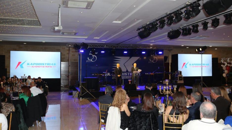
At a recent event celebrating 55 years of continuous presence in the Cypriot business scene, Kapodistrias Company revealed its new logo. This logo represents an evolution of the existing one and will anchor the company's new corporate identity, soon to be visible in stores and daily operations.
The new logo centers around the letter "K" and maintains the company's traditional blue and red colors. These elements, preserved from the previous logo, form an integral part of the company's identity. Additionally, the letter "K" has been given a dynamic twist to more strongly associate with the company's slogan, "Keeping Cyprus in Motion."
"After 24 years, we decided to refresh and modernize our logo. We wanted a logo that is simple yet versatile for various formats, modern, and signifies the new era we are embarking on. The colors remain the same, as does our philosophy. We believe that our philosophy and colors define us, and therefore, they remain unchanged," says Mr. Konstantinos Kapodistrias, Co-CEO of the company.

In the new logo, the left red shape represents the company's roots and legacy. It starts from the ground and grows upwards. The right blue shape symbolizes a solid foundation on which the company firmly stands, reaching high and gaining strength to go even higher.
Kapodistrias Company was founded on March 3, 1969, by the late Christoforos Kapodistrias and is nearing its 55th anniversary. Today, it leads Cyprus’ automotive aftermarket, daily supplying the market with genuine spare parts, tires, lubricants, professional tools, and workshop equipment.


